SB Events
Positioning an event producer as the strategist, not the vendor.
Client
SB Events
- Capabilities
- Brand StrategyMessaging & VoiceVisual Identity
- Sector
- Events
- Duration
- Brand System
- Role
- Brand and positioning system
- Year
- 2026
SB Events is led by Sara Beth Raab, an event producer recognized with a Telly Award and a spot on BizBash's Top 40 Under 40. The work was already exceptional. What it lacked was language: a brand that framed Sara Beth as the strategist behind a high-stakes event, not the vendor booking it. We built the positioning and brand system that names what she actually does, then carried it into a website strategy ready to build.
The reputation was bigger than the words for it.
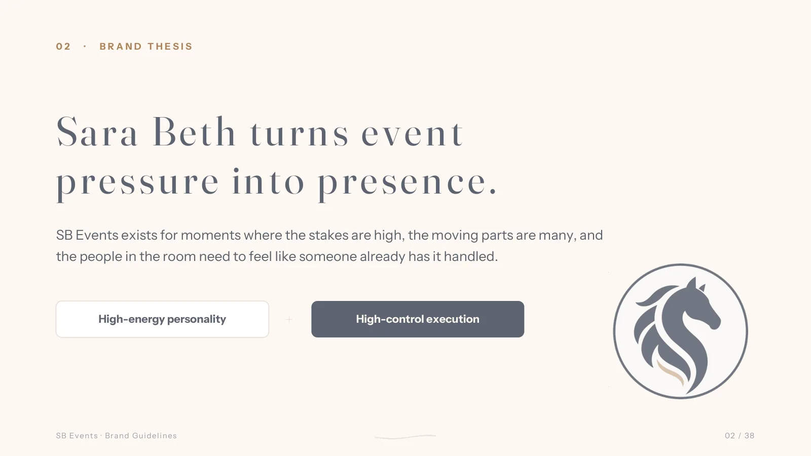
Sara Beth Raab spent ten years behind a camera before moving into corporate event strategy and large-scale production. The instinct she built there, reading a room and seeing it before it happens, is the real product. But the business was described the way most event work is described: a list of services and logistics. None of that captured why the people in the room trust her to hold the high-stakes ones.
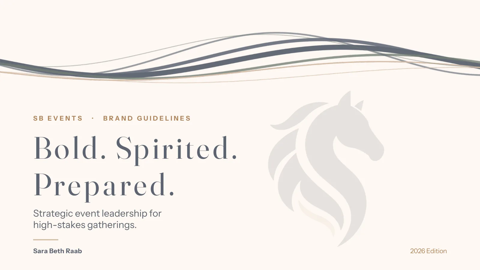
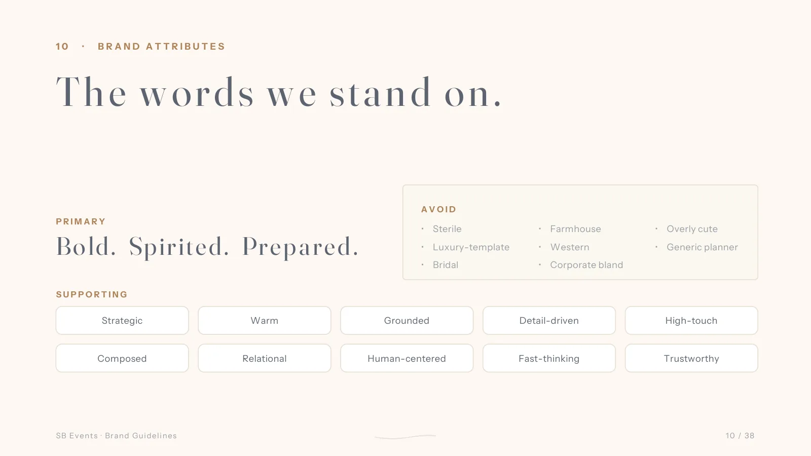
Bold. Spirited. Prepared.
The brand is built on three attributes, supported by strategic, warm, grounded, detail-driven, and high-touch. The line that carries it is plain: the calm behind high-exposure events. Sara Beth turns event pressure into presence, and the brand says so in the first sentence instead of burying it under a service menu.
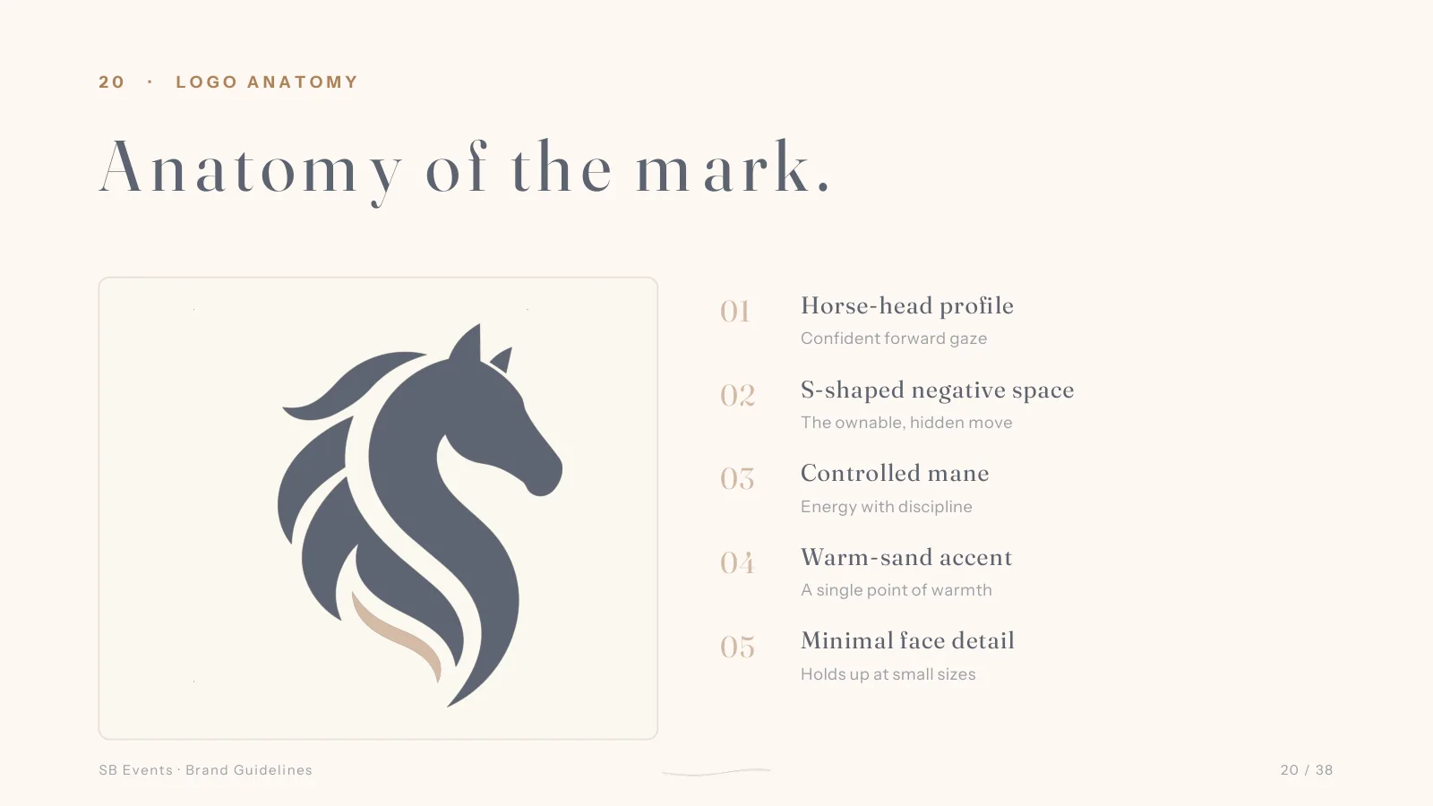
A founder mark, hidden in plain sight.
The identity is anchored by a horse-head profile with a confident forward gaze. It is a founder symbol, not a farm reference: spirited energy, forward motion, strength under control. An S-shaped negative space sits inside the mark, the ownable move you only catch once you are looking. The lockup pairs the horse with the SB wordmark and a warm-sand underline beneath EVENTS.
A system that stays calm under pressure.
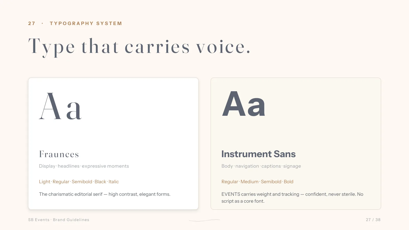
The color system runs on Storm Blue and Grounded Sage, warmed by Warm Sand and Soft Cream, with Diva Blush held back as a tertiary whisper that never leads. Typography pairs Fraunces, a charismatic editorial serif, with Instrument Sans for body, navigation, and signage. The result reads confident without ever turning sterile.
A website built to earn the call.
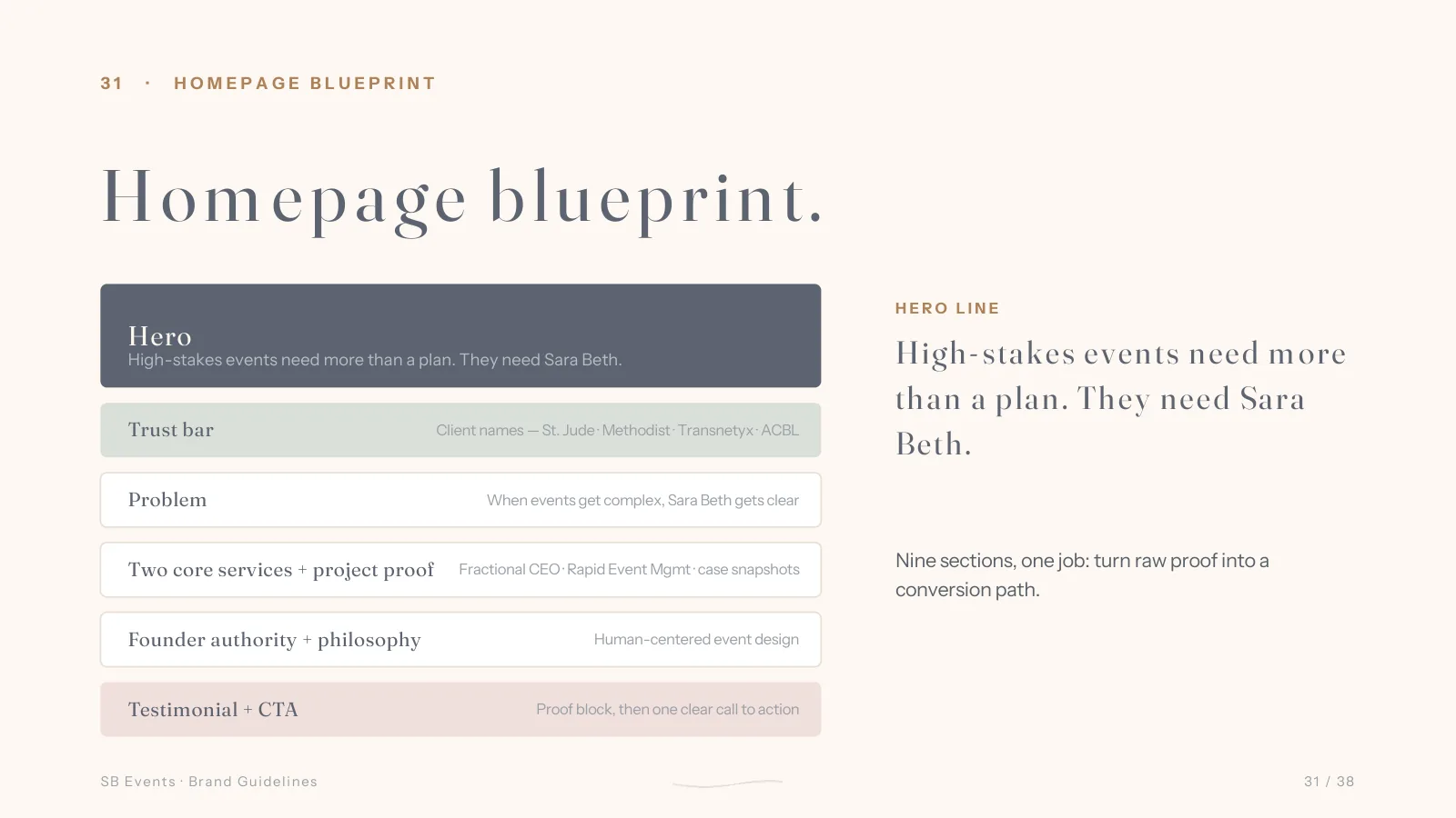
A pretty website is not proof. For an event strategist, the site has one job before the first call: trust. The brand system carries into a website strategy and page blueprints for the homepage, services, work, and about, each one organizing the proof Sara Beth already has, client names, projects, and media, into a single path that earns the call.
Color System
Storm Blue
#5D6572
Grounded Sage
#6F7B70
Warm Sand
#D4BBA5
Soft Cream
#FEF8F2
Diva Blush
#F0DFDC
What we shipped.
- Brand positioning and strategic narrative
- Brand attributes (Bold, Spirited, Prepared)
- Messaging and voice guide
- Logo and monogram system (horse-head mark with hidden S)
- Six-color system with usage rules
- Typography system (Fraunces and Instrument Sans)
- Website strategy and page blueprints (home, services, work, about)
- Recognition and credibility framing (Telly, BizBash)
- Brand guidelines document
If your work is ahead of your website, the gap is costing you.
The Brand + Website Review names the gap. The Brand + Website System closes it.